Responsive Image module is a core module in Drupal 8 and this guide will show setting up this module with working example.
Steps:
-
Enable the Responsive Image module at http://www.yoursite.com/admin/modules.
-
We can use existing Breakpoint group but in this guide we will create our own Breakpoint group. It can be created as module or as theme and we will create this as module. Inside
/modulesfolder of your Drupal 8 site, create a folder labelled as "site_optimization". -
Inside the
/modules/site_optimizationfolder create the info file with filename of "site_optimization.info.yml". Copy and paste the following codes inside this file:name: Site optimization description: Site optimization. type: module package: Custom version: 1.0 core: 8.x -
Still inside the
/modules/site_optimizationfolder create the info file with filename of "site_optimization.breakpoints.yml". Copy and paste the following codes inside this file:site_optimization.big_screen: label: big screen mediaQuery: '(min-width: 1025px)' weight: 4 multipliers: - 1x site_optimization.tablet_landscape: label: tablet landscape mediaQuery: '(min-width: 769px)' weight: 3 multipliers: - 1x site_optimization.tablet: label: tablet portrait mediaQuery: '(min-width: 481px)' weight: 2 multipliers: - 1x site_optimization.smalltouch_landscape: label: smalltouch landscape mediaQuery: '(min-width: 321px)' weight: 1 multipliers: - 1x site_optimization.smalltouch: label: smalltouch portrait mediaQuery: '(min-width: 1px)' weight: 0 multipliers: - 1x -
Clear the Drupal cache and enable this site_optimization module we have created.
-
We will create four image styles to support major device screen sizes. Go to http://www.yoursite.com/admin/config/media/image-styles and click "Add image style" button. Populate the "Image style name" field with "Image quarter (max width 320px)" and "Machine-readable name" field with "image_quarter".
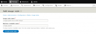
Add "Scale" effect.
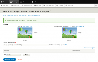
... and populate the "Width" field with "320" and leave the "Height" field empty. This settings will limit the image to maximum width of 320 pixels and height size will be auto.

-
Lets create the second image style. Go to http://www.yoursite.com/admin/config/media/image-styles and click "Add image style" button. Populate the "Image style name" field with "Image half (max width 480px)" and "Machine-readable name" field with "image_half".
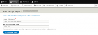
Add "Scale" effect.
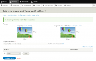
... and populate the "Width" field with "480" and leave the "Height" field empty. This settings will limit the image to maximum width of 480 pixels and height size will be auto.

-
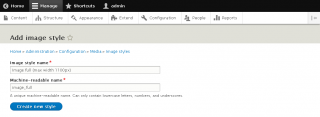
Lets create the third image style. Go to http://www.yoursite.com/admin/config/media/image-styles and click "Add image style" button. Populate the "Image style name" field with "Image part full (max width 768px)" and "Machine-readable name" field with "image_part_full".
Add "Scale" effect.

... and populate the "Width" field with "768" and leave the "Height" field empty. This settings will limit the image to maximum width of 768 pixels and height size will be auto.

-
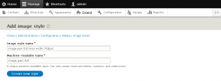
Lets create the fourth image style. Go to http://www.yoursite.com/admin/config/media/image-styles and click "Add image style" button. Populate the "Image style name" field with "Image full (max width 1100px)" and "Machine-readable name" field with "image_full".
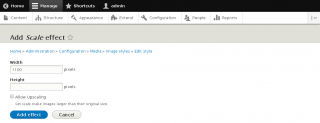
Add "Scale" effect.

... and populate the "Width" field with "1100" and leave the "Height" field empty. This settings will limit the image to maximum width of 1100 pixels and height size will be auto.
-
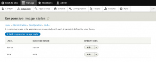
Now we will create a Responsive image styles. Go to http://www.yoursite.com/admin/config/media/responsive-image-style and click "Add responsive image styles" button.
-
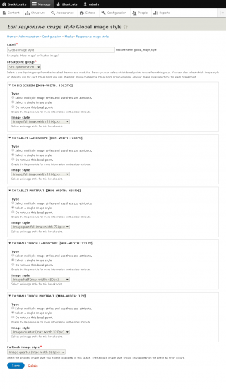
Populate the "Label" with "Global image style". Select "Site optimization" from "Breakpoint group" dropdown menu. Collapse the "1x big screen [(min-width: 1025px)]", select the "Select a single image style." option from "Type" and select "Image full (max width 1100px)" from "Image style" dropdown menu. Collapse the "1x tablet landscape [(min-width: 769px)]", select the "Select a single image style." option from "Type" and select "Image full (max width 1100px)" from "Image style" dropdown menu. Collapse the "1x tablet portrait [(min-width: 481px)]", select the "Select a single image style." option from "Type" and select "Image part full (max width 768px)" from "Image style" dropdown menu. Collapse the "1x smalltouch landscape [(min-width: 321px)]", select the "Select a single image style." option from "Type" and select "Image half (max width 480px)" from "Image style" dropdown menu. Collapse the "1x smalltouch portrait [(min-width: 1px)]", select the "Select a single image style." option from "Type" and select "Image quarter (max width 320px)" from "Image style" dropdown menu. In "Fallback image style" dropdown menu select "Image quarter (max width 320px)" option and click "Save" button.
-
To test, create a content and upload an image inside the Body field. Click "Source" button on WYSIWYG to edit the HTML code of the uploaded image and insert
data-responsive-image-style="global_image_style"inside theimgtag. Click "Save and publish" button.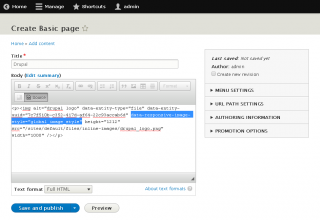
-
The output HTML of the test image should have
picturetag.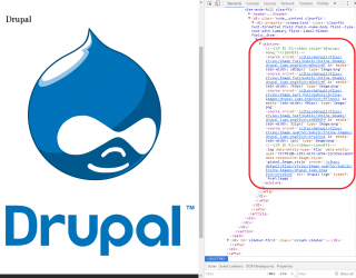


Comments
arpeggio
Fri, 01/10/2020 - 10:01
In reply to Enable site_optimization module by r-m-n (not verified)
You must have missed step 2.
You must have missed step 2. Saying:
... Inside /modules folder of your Drupal 8 site, create a folder labelled as "site_optimization".
Not converting editor images into picture tag
Hi
Done all the above steps but my editor images are not getting responsive image style.
Pleas help!
TIA
arpeggio
Thu, 02/27/2020 - 19:38
In reply to Not converting editor images into picture tag by Rajneesh (not verified)
Please check your logs to…
Please check your logs to get some clues to fix your issue and double check the steps above (you might have missed a step or two like missing to enable the site_optimization module).
Enable site_optimization module
Enable this site_optimization module
I can't see how to do this, am I missing something?